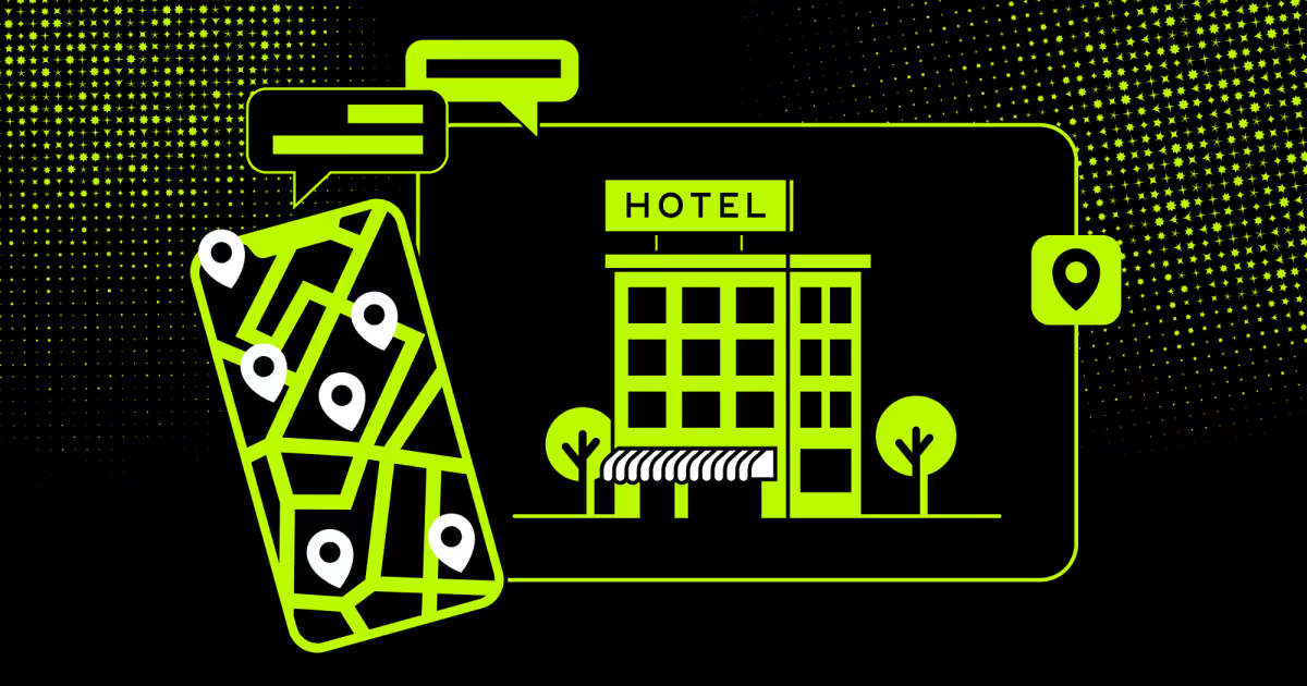
Guests judge hotel websites faster than they evaluate the pool. At COAX Software, we build hospitality tech. Over sixteen years, we learned that a website is a booking engine. Across resorts and hostels, the pattern holds. Guests judge trustworthiness in seconds. Slow sites lose bookings instantly
Below, we cover what makes hotel website design work and share the best examples. We also explore where most sites go wrong and how to choose between a template and a custom build.
What makes a great hotel website design?
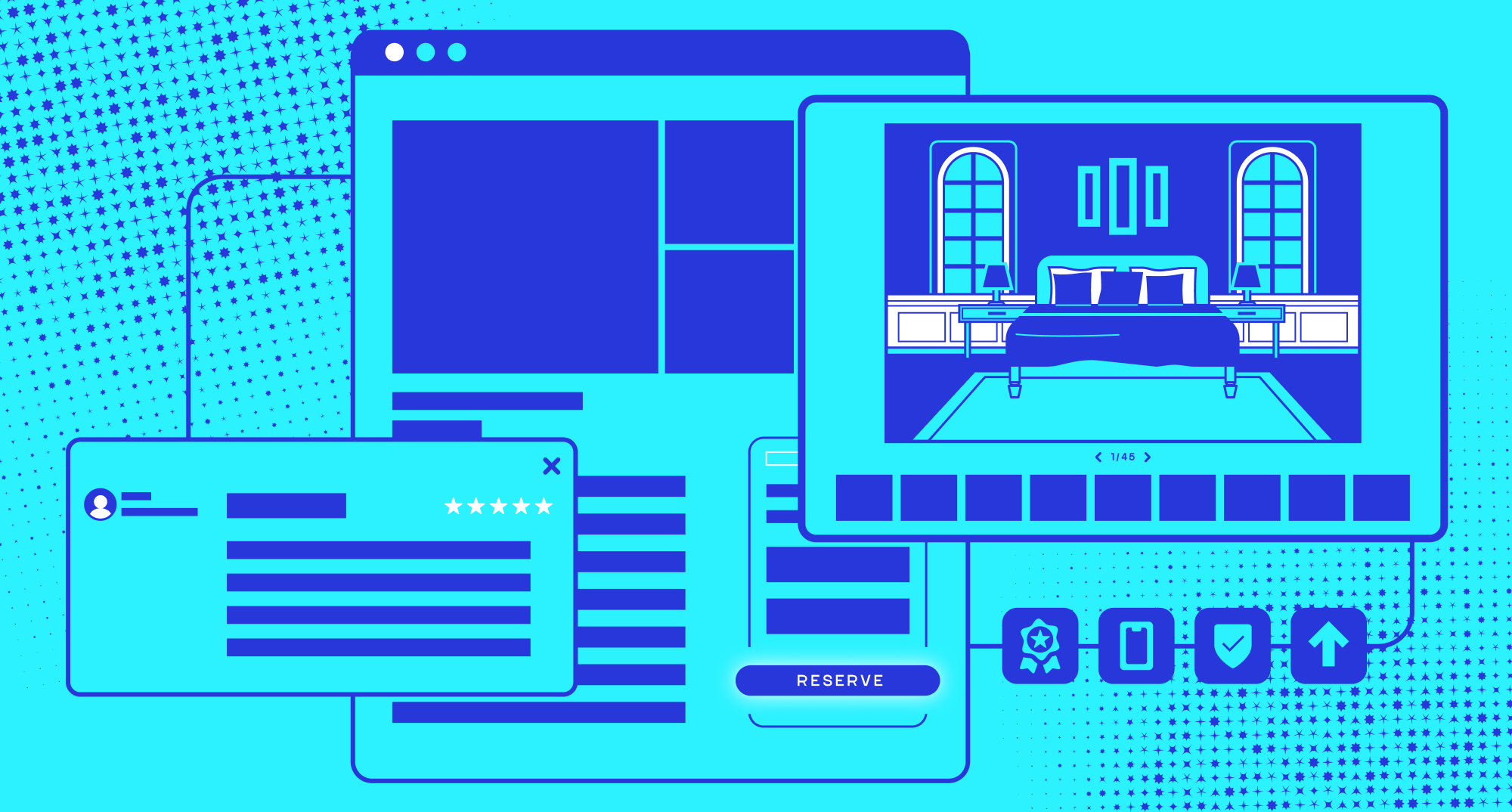
A great hotel website does three things at once. It loads fast, it shows the room honestly, and it gets a guest to "book" in as few clicks as possible. Everything else, color palettes, fonts, and animations, is secondary to that core job. Website design for hotels succeeds or fails on functional clarity first, aesthetics second.
To spot a site built to convert versus one built for awards, look at the first five seconds. That brief window tells you everything about its true purpose. Here's what's doing the work:
Speed that keeps load times under three seconds on mobile. Most hotel searches start on a phone in an airport lounge or a taxi backseat. A resort site stuffed with auto-playing 4K hero footage might look stunning on a conference room monitor. Still, it will stall out on a guest's spotty hotel Wi-Fi or 4G connection. The guest will then close the tab before the homepage even finishes loading.
Visual proof through real photography and video. Not stock images that could belong to any property on earth. A guest can usually tell within seconds what they are looking at. They know if it is the actual room they will sleep in or a generic stock photo. That gap kills trust fast.
Frictionless booking with a visible "book now" path from any page, in two clicks or fewer. This is where great hotel website design earns its name. The booking button shouldn't vanish once a guest scrolls past the homepage. It should follow them through the gallery, the amenities page, and even the dining menu.
Mobile-first layout that doesn't just shrink the desktop site but rethinks it for thumbs. That means bigger tap targets and a date picker that does not require pinch-zooming. The checkout flow must be built for one-handed scrolling. It should never be a desktop form crammed onto a six-inch screen.
Clear rate transparency so guests see taxes and fees before checkout, not as a surprise. Nothing torpedoes a near-booking faster than a $180 quote ballooning to $230 at the final screen.
Local context like neighborhood guides, transit info, or nearby attractions builds trust. Guests want practical details. A page listing the walk time to the nearest metro stop or three close restaurants does wonders for confidence. This helps much more than another carousel of lobby photos.
These six qualities form the backbone of a high-performing accommodation website design. They ensure the site actually drives bookings instead of just looking good in a design portfolio.
"A website that looks beautiful but takes six seconds to load on a phone isn't a design win. It's a booking loss. We've rebuilt platforms where the entire performance budget went to one hero video, and conversions doubled once we cut it," shares Orest Falchuk, Head of Engineering at COAX Software.
This is the engineering reality: most failures aren't aesthetic, they're architectural. A platform built on cookie-cutter booking engines will always lose. Its detached local hosts cannot compete. A leaner, community-first ecosystem wins every time. We saw this directly when building the Stay Altered platform. Their real-time PMS integrations and automated local revenue flows mattered more than superficial visual flourish. The same principle applies to hotel website design. The architectural backend decides how much real-world impact the frontend can actually deliver.
Luxury and resort hotel websites
Luxury and resort properties sell an experience before they sell a room. Their websites lean harder on emotion and visual storytelling than any other hotel category. That doesn't mean function takes a back seat. The best resort website design still gets guests to book quickly. It just does it with more cinematic framing.
For example, Aman's guests fell in love with the personalized experience of staying at one of its properties. Still, the website told a different story. So Aman rebuilt the entire experience from the ground up. The new mobile-first site stripped away clutter in favor of classical proportions and refined typography. Stunning imagery moved front and center through immersive rich media, full-width layouts, and gallery views. The booking journey itself became streamlined.
The results spoke for themselves. Average session duration rose by 30%, transactions climbed 28%, and revenue grew 25%. Average order value increased 8%, and Google PageSpeed scores jumped 86%. With these promising results in mind, let’s break down what brings them in.
What should a luxury hotel web design include?
Luxury resort websites succeed by using authentic high-resolution visuals. They capture guests by offering direct booking incentives. It’s also worth featuring activity pages and providing multilingual support for international guests.
Skipping any of these creates a credibility gap fast.
High-resolution imagery of rooms, grounds, and amenities shot in real lighting conditions. Do not stage them with artificial fill light that makes every property look identical.
Video or motion content should convey atmosphere, ideally under fifteen seconds per clip. This is long enough to set a mood and short enough not to tax mobile data.
Offer direct booking incentives like rate matching or perks not available on OTAs. Resort guests increasingly compare prices across three or four tabs before committing.
Spa, dining, and activity pages should function as standalone mini-sites within the main one. Each needs its own booking flow rather than a single buried contact form.
Provide multilingual support for international guest segments common at resort properties. A third or more of bookings often originate outside the home market.
Ultimately, this is what defines modern luxury hotel website design. It’s about creating an immersive experience that makes guests feel the value before they ever see the price.
COAX engineered a booking platform to handle real-time availability across multiple property types. On this project, the challenge wasn't the visual layer at all. It was making sure pricing and inventory updates propagated instantly across every page a guest might land on. A gorgeous spa page means nothing if the booking widget is showing yesterday's availability. Now let's look at who's translating that principle into a real, working website.
Examples of good hotel websites
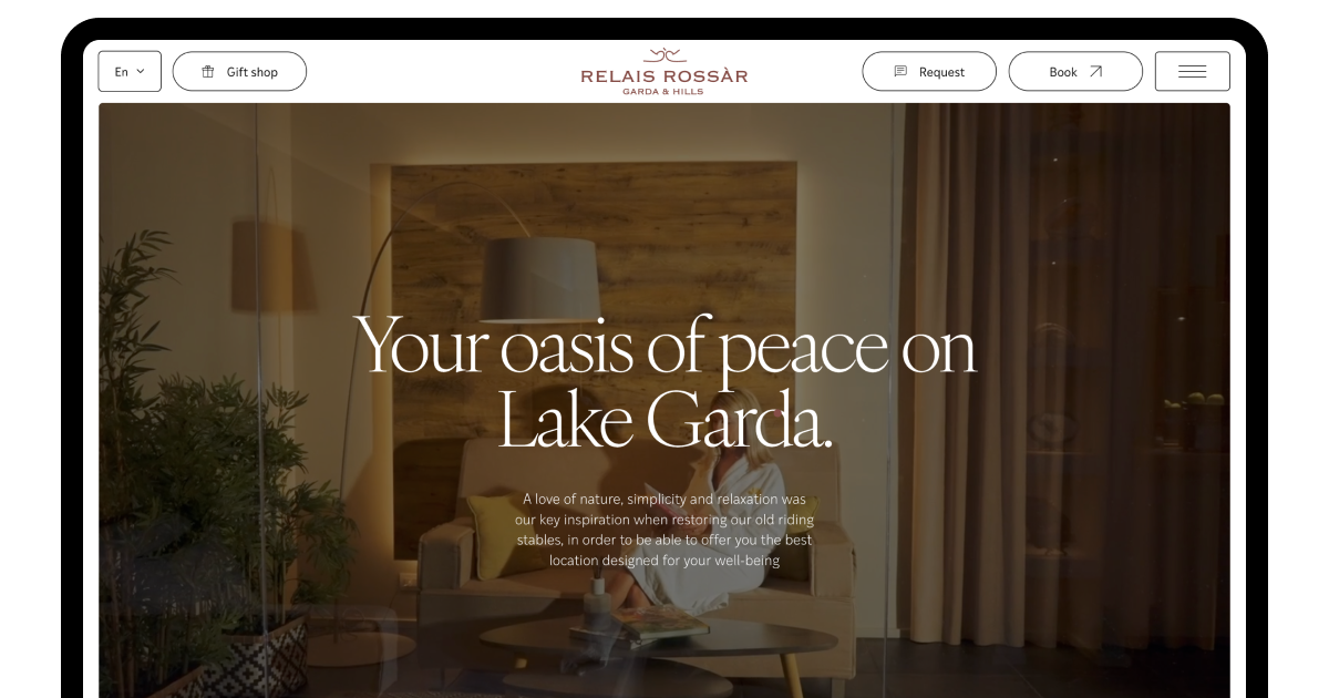
Relais Rossar's site balances editorial-style photography with a booking widget that never disappears from view. This pattern is common among well-reviewed hospitality website design examples.
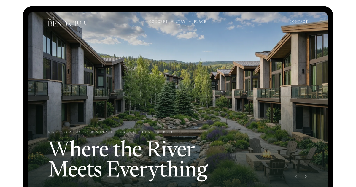
The Bend Club takes a similar approach. It uses full-bleed imagery and short page-load times to keep the luxury feel without sacrificing speed.
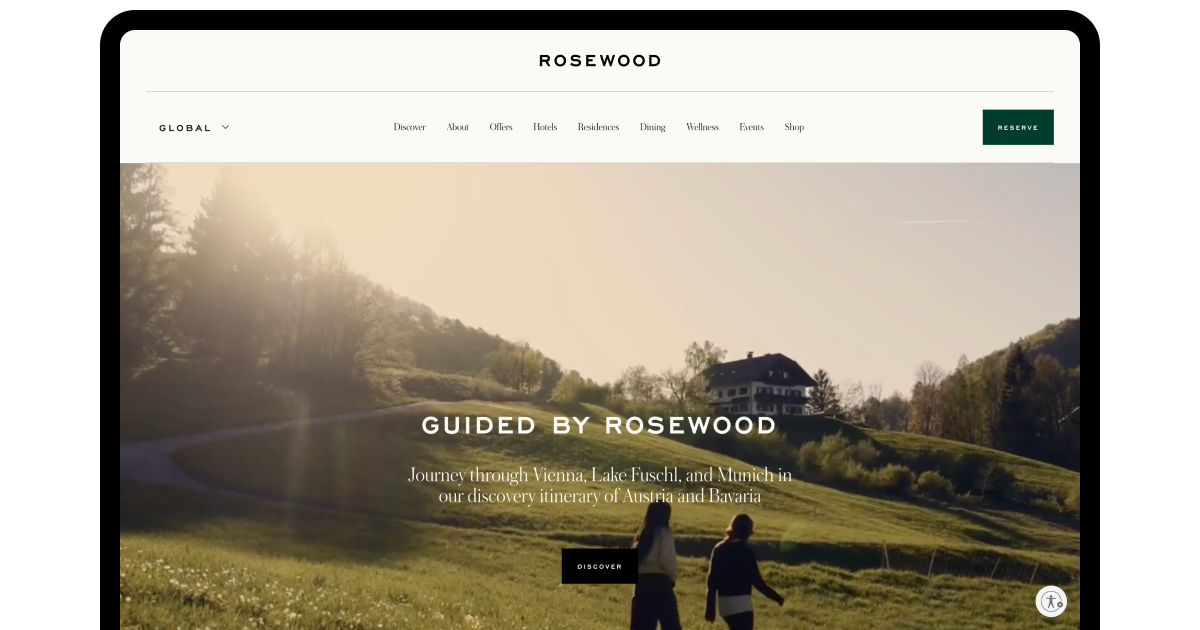
Rosewood pushed its brand beyond "A Sense of Place" toward something closer to a philosophy of connection. Within this framework, hospitality becomes a bridge between cultures and creativity. It ultimately unites the community. The hotel also orchestrates entire experiences, wellness programs, art tours, and meals with local chefs. The hotel becomes a gateway to a place, not just a bed for the night.
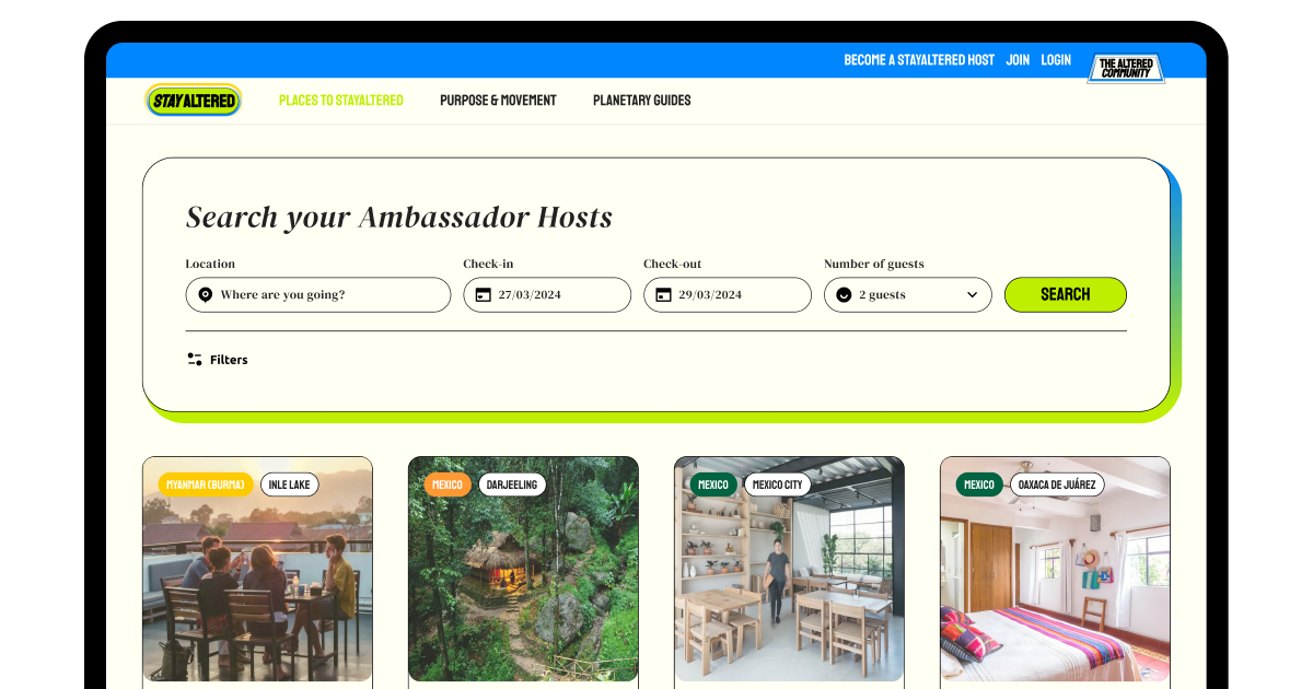
Closer to our own work, the same principle showed up on a smaller scale with StayAltered. The biggest lift in guest trust came not from a redesign. It was from surfacing real check-in instructions and host response times directly on listing pages. All successful hotel web designs share the same underlying truth. Specificity, whether editorial or operational, builds the trust that generic polish never quite manages.
Bad design examples
Not every property gets this right, and the gap is often stark. The Exmouth View Hotel's website has been singled out as one of the worst hotel website design examples. It has outdated layouts, mismatched logos across pages, and no mobile-responsive template. It gets nearly everything wrong at once.
Other failures are subtler, dressed up as intentional design choices:
Dr. Wilkinson's Backyard Resort pairs a distinctive pastel theme with a full-screen menu that hides navigation almost entirely. The look is undeniably stylish, but burying the nav behind a hidden menu turns a "find the spa page" task into a guessing game.
The Moore Hotel in Seattle leans on brutalist design cues, an atmospheric motion header, and a deliberately minimal nav. Stark and stripped-down can read as confident. But a guest hunting for booking details shouldn't have to fight the layout to find them.
Style without an accessible structure isn't design. It's just decoration. This makes accessible web design a must for every company. We saw this when building Hosty, a property management platform. Every interface choice that looked clever in a mockup got reconsidered the moment we watched a real user hesitate over where to click next. Hospitality website design that prioritizes mood over wayfinding might win a design blog feature. However, it loses the guest who just wants to check room rates without solving a puzzle first.
Tips for making a great luxury hotel website design
The beauty of a resort hotel homepage design means nothing without the right infrastructure. The checkout system must keep inventory and pricing synchronized in real-time. If you're building or rebuilding a luxury or resort site, prioritize these in order:
Audit your load times before touching the visual design. Speed problems undermine every other improvement.
Shoot new photography every season rather than reusing five-year-old images.
Keep the booking widget visible on every scroll position, not just the homepage.
Test on real phones in different network conditions. Not just a desktop browser at full bandwidth.
Take the Re-Plan booking service, for example. We built a system that manages live availability for hotels, vacation rentals, and event venues. What we learned was that the real bottleneck isn't the front-end design. It's the backend data pipeline that needs to propagate pricing updates across every channel in milliseconds. If that foundation isn't solid, your gorgeous homepage has no real power to convert.
Boutique hotel websites
Boutique hotels compete on personality rather than scale. Their websites need to feel handcrafted without looking slow or amateurish. The challenge is balancing a distinctive boutique hotel website design with the same conversion fundamentals.
What should a boutique hotel website include?
Smaller properties often have smaller budgets, which pushes many toward templates. Successful ones still invest in custom photography and a tight, branded color palette. They do so even when the underlying template is off-the-shelf. Customization budget should go toward content and imagery first, code second, unless conversion data says otherwise.
A practitioner's note on the web design for hotels. Specificity, not polish, builds confidence with guests choosing a smaller, less-known property over a recognizable chain. That principle, more than any color scheme, is what separates hotel web design that converts from design that just decorates.
Examples of good hotel websites
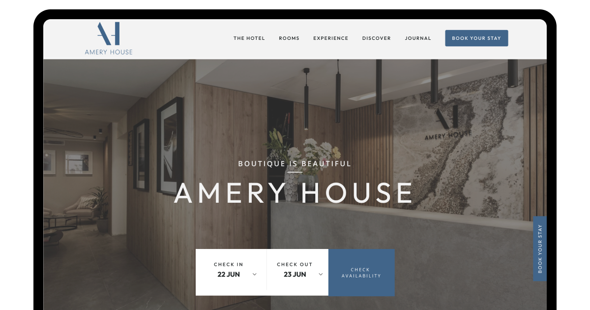
Hotel Amery in San Francisco has run since 2019 on a fun, modern boutique aesthetic. This distinct style has earned it a reputation as a top pick for couples and families alike. The site doesn't over-design itself out of usability. It leans into personality while keeping booking dead simple.
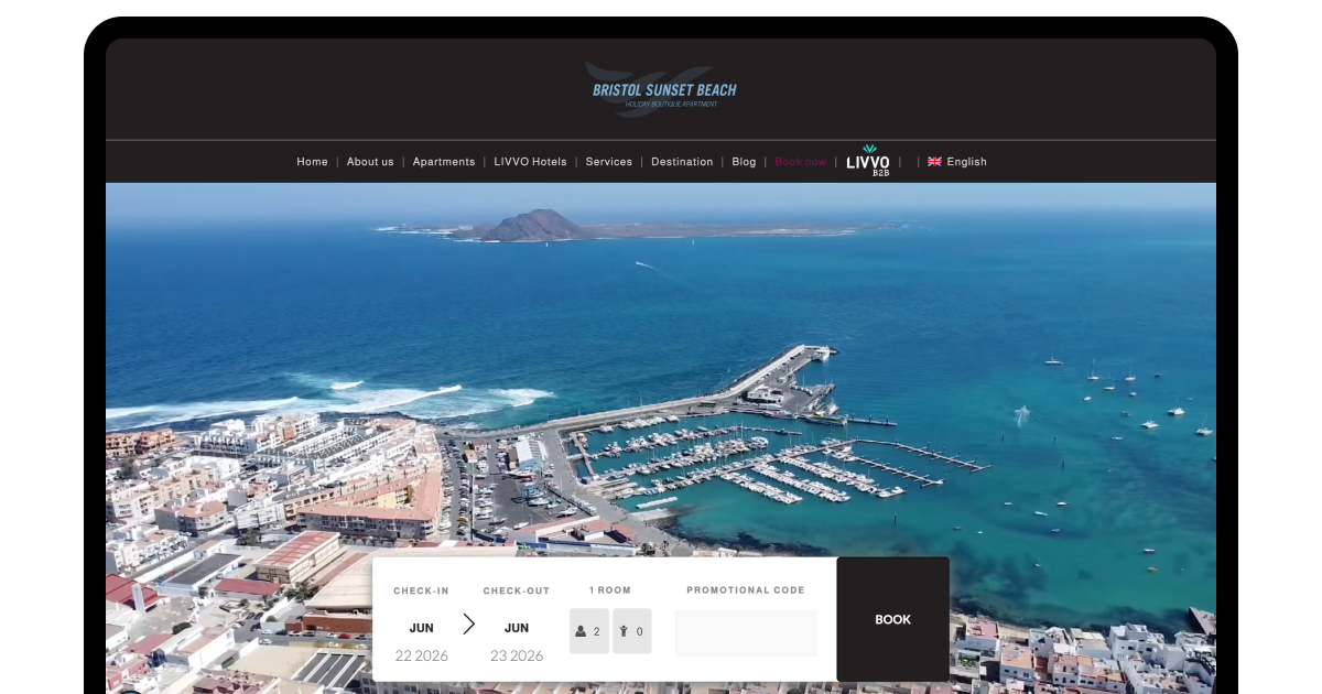
Bristol Sunset Beach takes a similar approach to the coast. It pairs a strong visual presence with distinct beach-boutique branding. This combination has landed it among the best hotel web design examples in its category. Both properties prove that a small footprint doesn't have to mean a forgettable site.
"The best boutique sites we've reviewed treat photography as the brand. Once a guest trusts the photos, the booking flow barely has to work hard to close the sale," describes the COAX Software engineering team.
Bad hotel web design in the boutique space
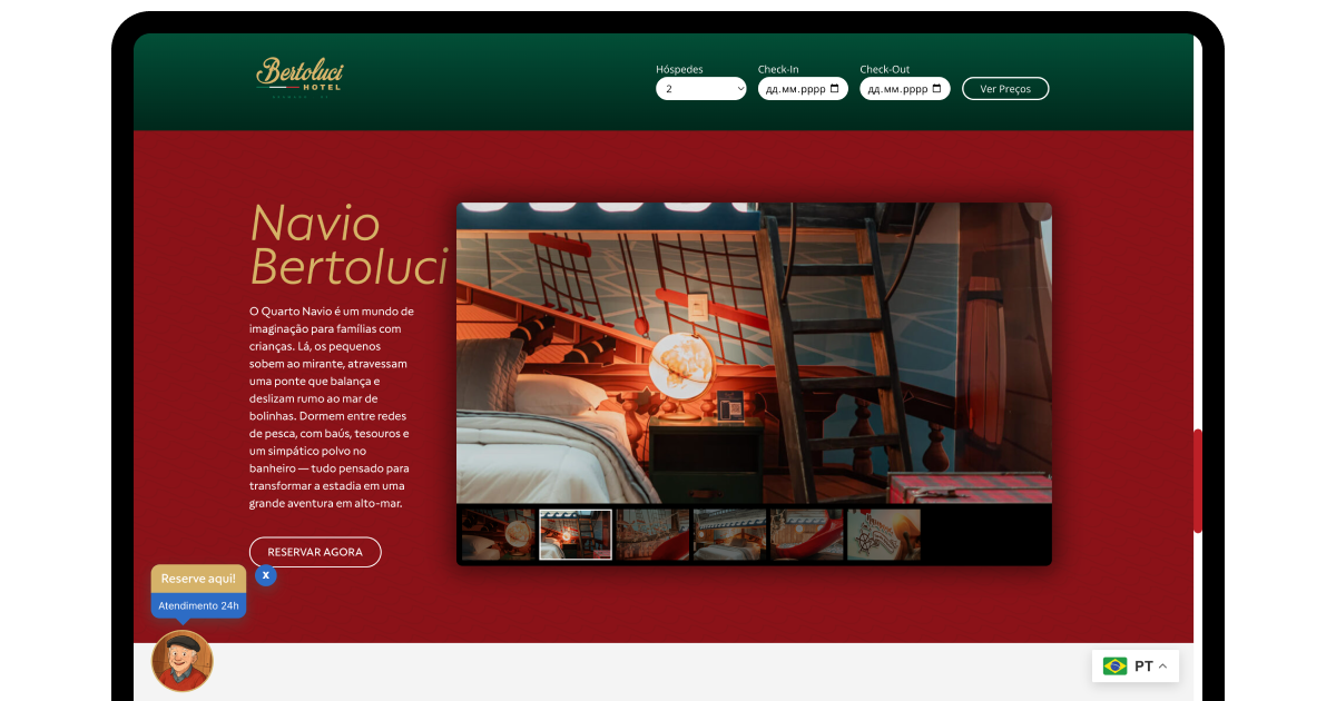
Plenty of hyper-local, high-end boutique properties in rural Europe still run on websites that feel frozen in 2005. This is particularly true across Tuscany or the Amalfi Coast. Hotel Bertolucci and similar independent Italian "borgo" sites are a clear case of this digital time capsule. The landing page is often a single, non-responsive image of the hotel gates. This keeps forcing visitors to hunt for a tiny "enter site" button before anything loads.
Once inside, room descriptions get embedded directly into low-resolution images instead of real text. On a phone, that text won't wrap or resize. So guests end up pinching and zooming sideways to read bed dimensions. It's the opposite of customer experience design done right. It costs these properties bookings they'd otherwise win on charm alone.
Tips for designing boutique hotel websites
For navigation, boutique sites should resist the urge to over-stylize. A hidden or overly minimal nav menu hurts boutique properties significantly. This is the same mistake frequently seen on some luxury resort sites. The issue is even worse here, since guests are already taking a trust leap on an unfamiliar brand. Keep these priorities in order:
Invest in photography first, since a tight, branded visual identity does more conversion work than a custom-coded template.
Surface operational details like check-in instructions and response times, not just room photos.
Keep navigation visible at all times, even on a stylized full-screen homepage.
Test text rendering on mobile to make sure no copy is trapped inside an image.
A hotel website design built on these fundamentals earns the right to look distinctive because the booking path underneath it still works.
Business hotel websites
Business travelers book fast, often on a deadline. Eventually, business hotel websites need to strip out anything that slows decision-making. This shares functionality with the best bed and breakfast website design principles: speed and clarity matter more here than atmosphere or storytelling.
What should a business hotel web design include?
The priorities differ sharply from leisure-focused properties. We have engineered complex booking architectures and high-performance digital platforms for years at COAX. Our work consistently supports global hospitality brands. Ever since then, our team has consistently found that even a single second of latency or a buried amenity tab can crater corporate conversion rates.
Loyalty program visibility front and center, since repeat business travelers often book through points.
Meeting and event space details with square footage and capacity listed plainly.
Wi-Fi and workspace specifics are called out explicitly, not buried in an amenities list.
Airport and transit proximity are stated in minutes, not just distance.
These travelers don't browse. They search and decide. A site optimized for this audience trims decorative elements that slow that process. This is the core of good website design for this segment.
Examples of good business hotel websites
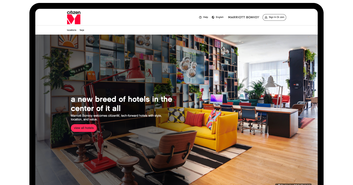
CitizenM is close to a masterclass in frictionless booking for the tech-savvy business traveler. The booking bar stays persistent across every page. Instead of a finicky drop-down calendar, the date-selection screen feels like a native app interface. It has clear per-night pricing visible right on the grid. The site immediately highlights what business travelers actually care about. It offers fast free Wi-Fi, XL king beds, and round-the-clock food and coffee. The room imagery shows functional detail, not contextless close-ups of folded towels.
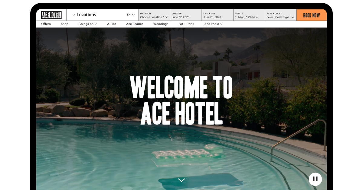
Ace Hotel proves a similar point from a different angle. The brand leans into a lifestyle-driven identity. But its booking infrastructure runs like an efficient business machine. A clean, high-contrast grid makes room sizes and work amenities instantly scannable. The main navigation features a dedicated "group bookings and meetings" link that routes corporate planners to a structured portal. It's one of the best website designs for hotel properties that refuse to choose between branding and function.
"Successful cases in this space prove the same point from different directions. A business traveler doesn't want personality stripped out. They want it layered on top of a booking flow that never makes them think twice", says Orest Falchuk, Head of Engineering at COAX.
Bad designs in the business niche
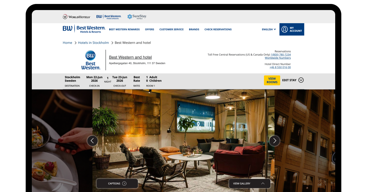
Best Western caters heavily to mid-market corporate travelers and conference attendees. Still, its web infrastructure has shown up in usability audits for checkout breakdowns. The core problem is data clutter paired with hidden pricing.
When a business traveler books for expense approval, they need the total cost immediately. However, Best Western's site frequently buries occupancy taxes, resort fees, and corporate discount summaries until the final payment screen. That's a textbook CRO mistake. If a $60 surprise shows up at the last click, the traveler has to back out and restart the entire search.
Budget and hostel websites
Budget hotels and hostels operate on thin margins, so their websites need to convert efficiently without expensive custom development. Two priorities decide everything else. Kill financial anxiety with upfront pricing and sell the social experience a budget traveler is actually buying.
What should a budget hotel website include?
A budget or hostel site lives or dies on transparency and mobile speed. This guest books from a phone, often mid-transit, and abandons fast if a number looks suspicious. Effective hotel booking website design in this category leads with what's included before it asks for a credit card.
Room-type clarity that separates dorm beds from private rooms at a glance, not three clicks deep.
Fee transparency that states what's bundled, like linens or locker access, and what costs extra.
Mobile-first booking built for one-handed use on a slow connection, not a shrunk desktop form.
Social proof through real reviews and live community content, since solo travelers book on peer trust.
Get these four right, and the rest of the design can stay simple. The next question is who's actually doing this well.
Examples of good hotel websites in the hostel sphere
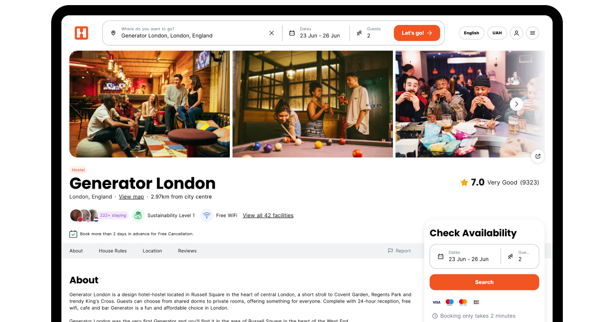
Generator Hostels treats hostel design with boutique-level polish but never loses the utility underneath. The interface uses a scannable grid that makes comparing a ten-bed mixed dorm against a four-bed female-only dorm instantly clear. The site eliminates checkout surprises. Guests see exactly what's included in the base rate and what costs extra before they ever reach payment. That's website design for hotels doing the one job that matters most for this audience, building trust ahead of the booking button.
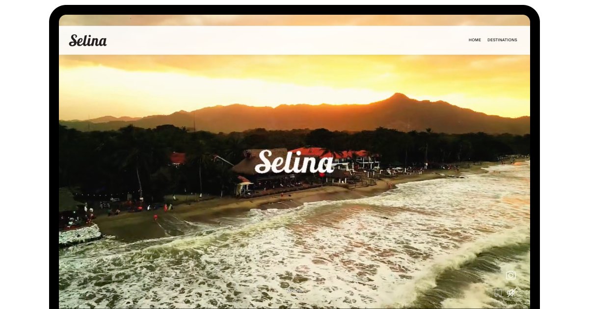
Selina takes a different angle, selling a digital nomad lifestyle rather than just a bed. Its guests often book multi-week or multi-destination stays. So the booking engine supports flexible date browsing and monthly co-living toggles without a single clunky reload. Room pages show live schedules for yoga classes, surf lessons, and communal dinners. It feels like a community hub instead of a directory. It's a sharp answer to what the best hotel web design looks like when the product being sold is a connection.
Bad designs for budget hotel websites
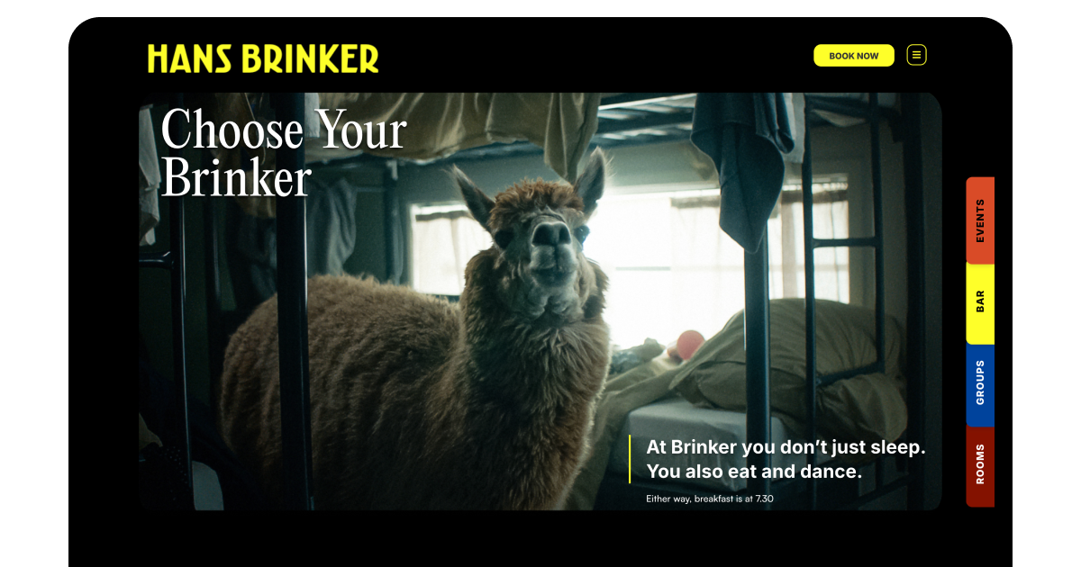
The Hans Brinker Budget Hostel built its brand on calling itself "the worst hostel in the world". For years, its site leaned into that joke a little too literally. The humor undercut the basics a traveler actually needs.
On mobile, text and navigation links frequently broke alignment. It’s a problem that's fatal for motel website design and hostel sites alike. The thing is, nearly every booking happens on a phone. Worse, check-in times and room restrictions, like age limits or kitchen access policies, sat buried under paragraphs of sarcastic marketing copy. A backpacker landing late from a delayed flight had to wade through jokes just to find an address. Personality is an asset until it blocks the guest from finding the one detail they actually need.
Tips for designing in the cost-conscious travel space
Budget and hostel properties don't need a big design budget. They need a disciplined information hierarchy. Prioritize these in order:
Split dorm and private listings at the top level, so guests self-select without scrolling past irrelevant rates.
State every fee upfront, since hidden costs erode trust faster for this audience than any other.
Surface community content directly, through real photos or live schedules, not generic stock imagery.
Keep practical info, like check-in times, separate from brand voice, so urgency never gets lost in personality.
A budget site that nails this hierarchy will out-convert a prettier, pricier hotel website design every time, because for this guest, clarity is the luxury.
Best hotel website design companies
Choosing a partner for your site depends heavily on your property type and budget. You must also consider how much you need the platform to do beyond looking good. Here's how the main options compare.
Approach
Best for
Typical cost range
Customization limit
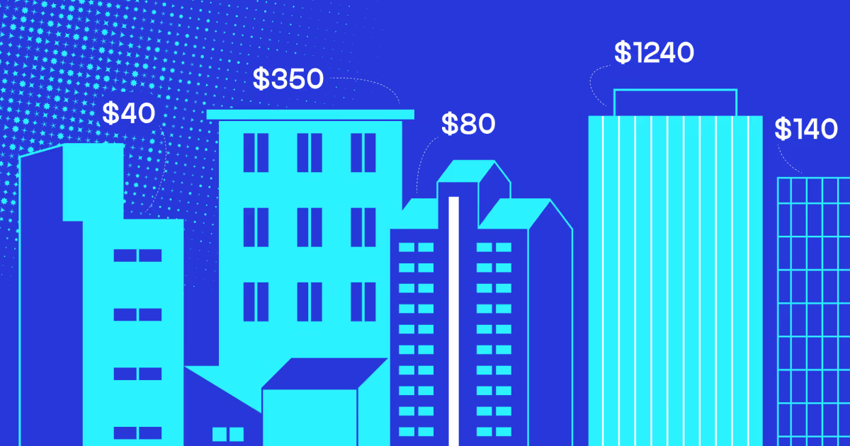
Template builders (Wix, Squarespace)
Small budget or hostel properties
$500 to $5,000
Low
Hospitality-specific platforms (MotoPress, etc.)
Boutique and mid-size hotels
$2,000 to $15,000
Moderate
Agency-built custom sites
Resorts, chains, complex booking needs
$20,000 to $100,000+
High
Engineering-led custom builds
Properties needing integrations, real-time inventory, or scale
$50,000 and up
Full
Hotel website design cost varies this widely because engineering complexity, not visual design, drives most of the price difference.
Template and platform-based builders like Wix or Squarespace work well when your needs stay static. A handful of room types, one property, no complex integrations. They're fast to launch and cheap to maintain, typically running $500 to $5,000. Hotel website design templates suit a small-budget property or hostel whose booking logic never changes month to month. However, customization options for these layouts stay limited.
Hospitality-specific platforms, like MotoPress, sit a step up. They are built specifically for boutique and mid-size hotels. Logically, they cost roughly $2,000 to $15,000 and offer moderate customization. It’s enough to handle branded photography, room-type variations, and basic booking widgets without full engineering support. They're a strong ground if you have outgrown a generic template but don't yet need bespoke work.
Agency-built custom sites run $20,000 to $100,000 or more, and they're suited to resorts, chains, or any property with complex booking needs. Among hotel web design companies, agencies deliver strong visual design and high customization. This approach is often closer to what resort website design demands once multiple room categories, seasonal pricing, and add-on services enter the picture. The limit shows up behind the scenes. Most agencies aren't built to handle deep backend engineering, like channel manager integrations or custom availability engines.
Engineering-led custom builds sit at the top of the range, starting around $50,000 and scaling with complexity. This approach fits properties needing real-time inventory sync, multi-system integrations, or booking logic unique enough. No template or off-the-shelf platform can flex to fit it.
From COAX’s experience, full customization here means the website design for hotels outcome isn't just visual. The booking engine itself is purpose-built. This is also where responsive web design services need to be tightly coupled to live booking data rather than just a mobile-friendly layout. Real-time pricing and availability must update consistently across every device.
"The question isn't whether to build or buy. It's about the capabilities that create competitive advantage. Those are the ones worth owning," says Orest Falchuk, Head of Engineering at COAX Software.
COAX has delivered hotel website design services and broader travel tech for fifteen-plus years, including booking platforms, fleet systems, and real-time inventory engines. Driven Connect illustrates the pattern well. The UK platform connects buyers with coach and minibus operators through competitive bidding, and the initial MVP launched in five months. User feedback later reshaped the business model entirely, adding B2C flows, emissions tracking, and multi-role interfaces. More than 400 operators now use the platform.
We've also seen the failure pattern that pushes hotels toward custom builds in the first place. A custom build avoids that, because the logic is yours from the start. This is where COAX's specific expertise applies directly. Ninety percent of our team is mid-to-senior engineers. This means the person solving your booking-engine integration has likely solved a version of it before. We also apply the same data protection standard to a single boutique property that we apply to enterprise clients.
If your hotel is scaling toward real-time inventory and multi-property management, you need a system that functions as core infrastructure rather than a simple marketing page. Achieving this level of performance requires specialized expertise. Working with a team offering combined hotel web design and engineering support is well worth the investment. The same logic applies to mobile app design services if a meaningful share of your bookings shift toward a dedicated app rather than mobile web.
FAQ
What is the best website design for a hotel?
The best hotel website design balances fast load times, honest photography, and a booking path visible from anywhere on the site. We saw this when developing Hosty, a rental platform we built for small hospitality businesses. Shaving seconds off page load improved how guests moved through the booking flow. In fact, Hosty's custom booking widget loads in under one second and completes bookings in under 60 seconds. Beyond speed, the right approach depends on your property type, guest segment, and inventory complexity.
How much does hotel website design cost?
Hotel website design cost ranges from around $500 for a basic template to over $100,000 for a fully custom, engineering-led platform. The gap comes down to backend complexity, not aesthetics. A boutique property with one room type pays template rates; a resort needing real-time inventory sync across channels pays for the engineering underneath, not the homepage layout.
What should a good hotel homepage design include?
A strong hotel homepage design needs:
A visible booking widget
Real photography shot on-site
Clear rates before checkout
Load time under three seconds on mobile, since most guests are searching from a phone.
We've watched conversion rates shift meaningfully once a heavy hero video got trimmed down on a client project.
Are hotel website design templates a good option for small properties?
Yes, hotel website design templates work well for budget hotels, motels, and small boutique properties without complex booking or inventory needs. They're fast to launch and cheap to maintain. The tradeoff appears later. Once you need multi-property management or live channel sync, a template's customization ceiling becomes the limiting factor, not the design itself.
What makes a hospitality website design trustworthy to guests?
Hospitality website design earns trust through accurate photography, transparent pricing, and visible reviews, not visual flourish alone. Guests notice within seconds whether a room photo matches reality. On every hospitality project we've built, the properties that showed honest, specific detail, real check-in instructions, actual response times, consistently outperformed.


.avif)


.avif)


%20for%20hotels.jpg)


.avif)

.avif)

.avif)


.avif)


.avif)

.avif)


.avif)


.avif)

We are interested in your opinion