Smooth out UX on all devices, keep visitors engaged, and get better SEO rankings and conversions. We create websites with media queries and flexible grids to guarantee the best possible performance and display on PCs, tablets, and smartphones.


Scroll down
scroll down button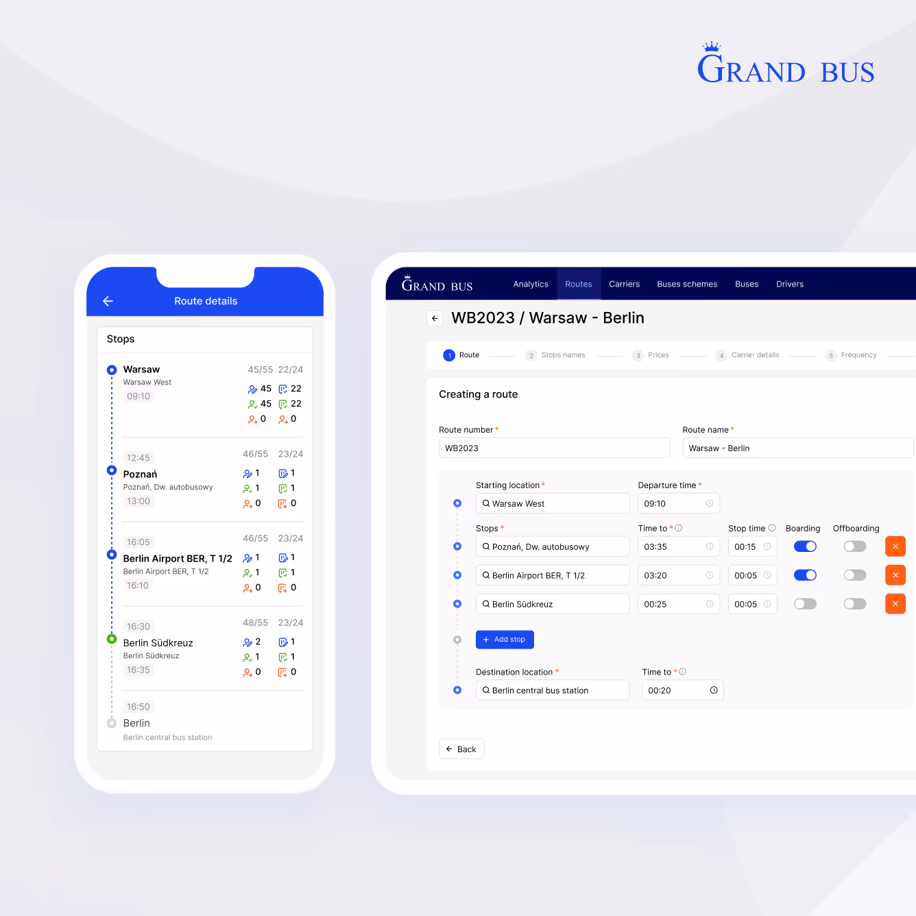
See the difference with a skilled responsive web designing company
Responsive design done right means the barriers between your audience and your message disappear. As an experienced responsive web development company, we build sites that load faster, hold attention longer, and convert better, whether on a phone, tablet, or desktop. With us, you get a strategic reconstruction and maximize performance where it matters. Let’s build something that works everywhere, every time.

What do you get with responsive design?

Tailored user experiences
Every scroll, tap, and swipe adjusts intuitively, serving perfect layouts that respect device constraints without sacrificing design intent. No more forcing desktop elements into mobile screens: your content reorganizes fluidly, prioritizing load speed and touch-friendly navigation.

Brand consistency across devices
Your brand’s visual essence stays intact, from 4K monitors to smartwatch screens, with intelligent scaling that preserves typography, color profiles, and UI patterns. Skilled responsive website design services ensure every breakpoint reinforces your brand.

Scalability for future growth
Your product grows with technology, automatically adjusting to new screen sizes and devices without costly rebuilds. Built-in flexibility means your content looks right today on smartphones, and tomorrow on whatever comes next.

Enhanced SEO performance
Google rewards mobile-friendly sites, and responsive web designing services ensure your content ranks higher by serving identical HTML across all devices. As a result, you only get one authoritative version of your site that search engines can crawl efficiently.

Competitive edge
While others frustrate mobile visitors with pinching and scrolling, your site delivers effortless browsing. Also, new screen sizes emerge yearly; your responsive site automatically accommodates them while competitors scramble with redesigns.

Improved accessibility
Responsive design ensures your website is accessible to all users, including those with disabilities. It ensures seamless navigation with structured layouts, scalable fonts, and touch-friendly interfaces, broadening your audience while meeting accessibility standards.
Types of solutions we offer

For eCommerce
We create responsive ecommerce design that automatically adjusts product displays, shopping carts, and payment flows to work perfectly on any device. No lost sales — your store works flawlessly on any device.

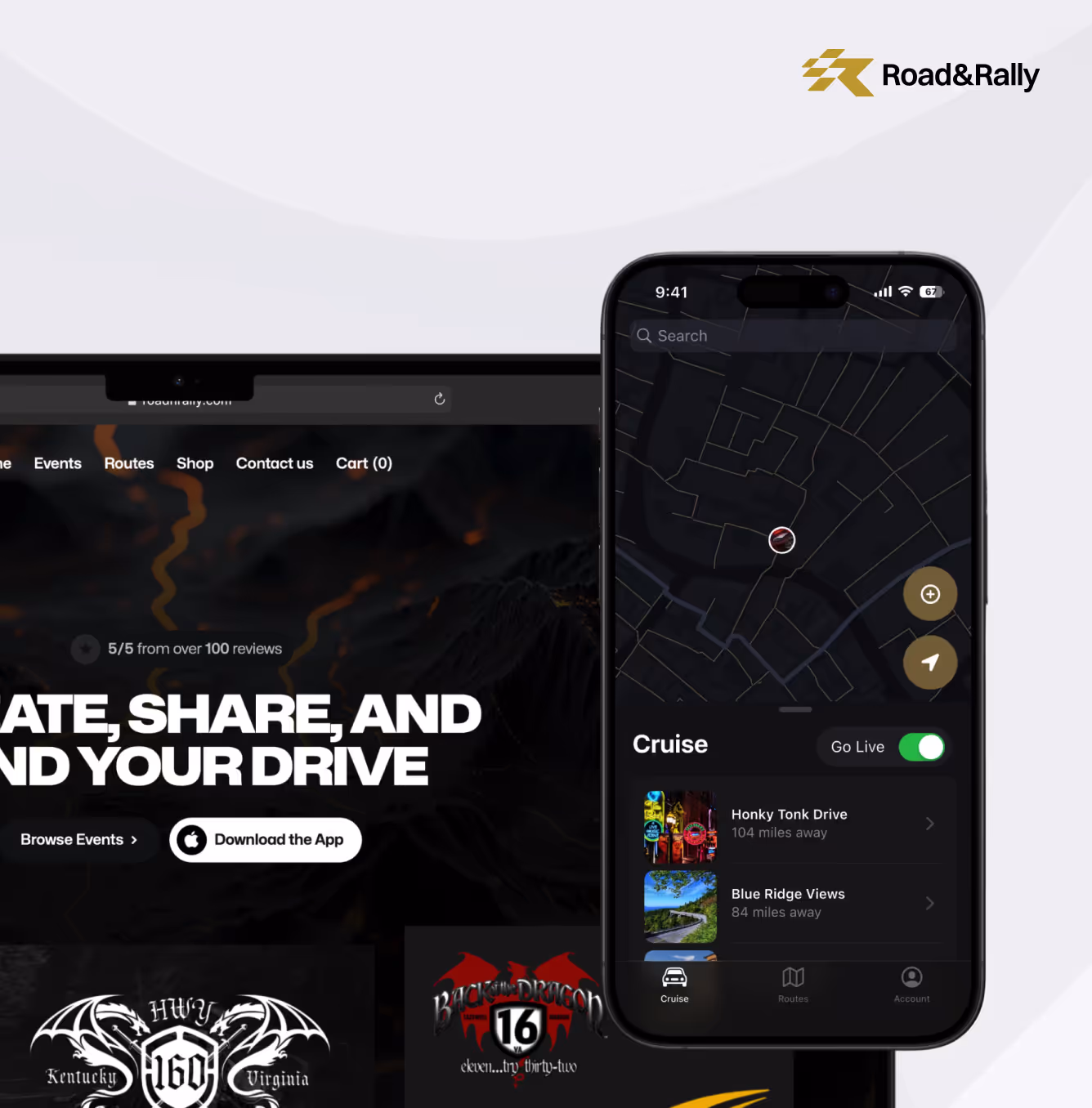
For travel & hospitality
COAX specialists design booking interfaces that reformat on the spot, showing full itineraries on desktops while prioritizing check-in buttons and mobile boarding passes on phones. You get fully functional booking tools on all devices, reduce drop-offs, and keep customers.

For transportation & logistics
We are your responsive website design company that optimizes tracking interfaces to display real-time shipment data on truck dashboards, warehouse tablets, and executive desktops. Multi-role dashboards mean desktop control, mobile simplicity, and one synchronized system.

For finance
Our developers build secure, responsive dashboards that adapt to financial data. Banking forms and payment flows automatically simplify on phones with touch-friendly inputs, while keeping all compliance fields accessible for desktop users completing lengthy applications.

For healthcare
At COAX, we know that lifesaving situations and patient support require the best responsive web design services. We ensure systems display medical forms legibly on phones and desktops. With us, doctors get detailed analytics, while patients access test results on mobile.

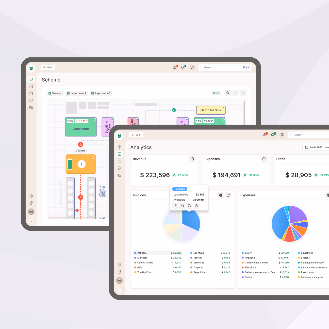
For construction
Our experts optimize project management tools to work on-site — blueprints stay zoomable on tablets, and bid forms are simplified for quick mobile submissions. You get dual dashboards with field rugged, office optimized, and the same live data everywhere.
Why choose COAX as your responsive web design company?
/ 01
Mobile-first approach
We prioritize responsive app design from the ground up, starting with streamlined mobile layouts that scale up to desktop, rather than squeezing desktop content down. This ensures faster load times on cellular networks and intuitive touch interactions, while still enabling full features for larger screens.
/ 02
Driven by your business objectives
We’re focused on your priorities first. COAX designers align every design decision with your KPIs, whether that’s increasing form completions, reducing support calls, or boosting average order value. Your analytics and user feedback directly shape interactions, ensuring the responsive experience moves your goals forward.
/ 03
Ensured results
At our responsive web designing company, your successful outcome is our main goal. we validate every layout with real device testing, measuring load speeds, touch accuracy, and conversion paths before launch. You’ll see the difference in your metrics: lower bounce rates on mobile, increased session durations, and revenue that reflects your site’s improved usability.
/ 04
Compliance with SEO and, if requested, WCAG2 requirements
Our responsive sites use clean, crawlable code that satisfies Google's mobile-first indexing while optionally incorporating WCAG 2.1 principles for accessibility. This means your content stays visible to both search engines and all users, including those relying on screen readers or keyboard navigation.

Trusted by our clients


How we craft the best responsive websites
Our responsive web development services begin with a technical audit, analyzing your current site’s performance, load times, and touch targets to identify gaps in cross-device performance. Every media query and content priority is documented in a responsiveness roadmap.
We map user journeys by device type, then architect flexible grids and component libraries that adapt. Scroll-depth heatmaps and input field analysis inform how we reorganize content hierarchies for thumb-friendly mobile use versus mouse-driven desktop navigation.
At the main stage, our responsive web design services company experts build interactive prototypes. Each design handoff includes style guides documenting spacing systems, image compression rules, and conditional loading behaviors for different network speeds.
Before full build-out, we test lightweight prototypes under real-world conditions like low bandwidth, older devices, and variable viewports, to validate speed and usability. This ensures assets like images and scripts degrade gracefully without breaking functionality.
We validate font readability on small screens, interaction patterns across input methods, and component behavior during viewport resizing. Our automated suites monitor rendering consistency, catching issues like improper media query triggers or elements that fail to adapt.
To provide the best responsive web design services, we implement progressive enhancement, deploying core content first, then layering in adaptive features based on device capabilities and network conditions. Post-launch, we fine-tune asset delivery using real-user metrics, ensuring smooth rendering across all screens.
Frequently asked questions and answers
Responsive web design is an approach where websites automatically adjust their layout, images, and content to look and work perfectly on any device, whether it's a phone, tablet, or desktop. As a responsive website design services company, we build sites that fluidly resize and reorganize elements so users get the best experience no matter how they browse.
Responsive vs adaptive web design comes down to how they handle different screens. Responsive design fluidly stretches and reshapes one layout to fit all devices, like water filling different containers. Adaptive design uses multiple fixed layouts that snap to specific screen sizes, like switching between premade outfits.
The cost varies based on your site's size and features, but our affordable responsive web design services ensure you get a mobile-friendly site without overspending. We tailor solutions to fit your budget while delivering the best quality.
Getting layouts to adapt perfectly across thousands of device sizes requires careful planning — what works on desktop often needs complete restructuring for mobile. Performance is tricky too, as the same site must load quickly on both high-speed connections and mobile data.
Using responsive website development services can significantly improve your site's SEO. Google prioritizes mobile-friendly websites in search results, and responsive design ensures your content works perfectly across all devices with a single URL — making it easier for search engines to crawl and rank your pages.
We can definitely upgrade your existing website with responsive design capabilities. Our approach focuses on adapting your current content and functionality to work across all devices. Using modern coding techniques, we'll turn your fixed layout into one that automatically adjusts while maintaining all your existing features and content structure.
Building a responsive website generally takes several weeks when working with a professional responsive website development company. The exact duration depends on your site's size.
While responsive design involves higher initial costs than traditional websites (due to complex testing across devices), working with an experienced responsive website design services company actually reduces long-term expenses. You avoid the ongoing costs of maintaining multiple site versions, and the mobile-friendly results tend to perform better commercially.
Want to know more?
Check our blog


.avif)


What I’ll do next?
1
Contact you within 24 hours
2
Clarify your expectations, business objectives, and project requirements
3
Develop and accept a proposal
4
After that, we can start our partnership