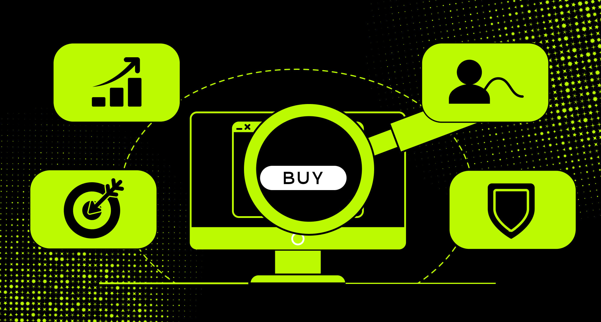
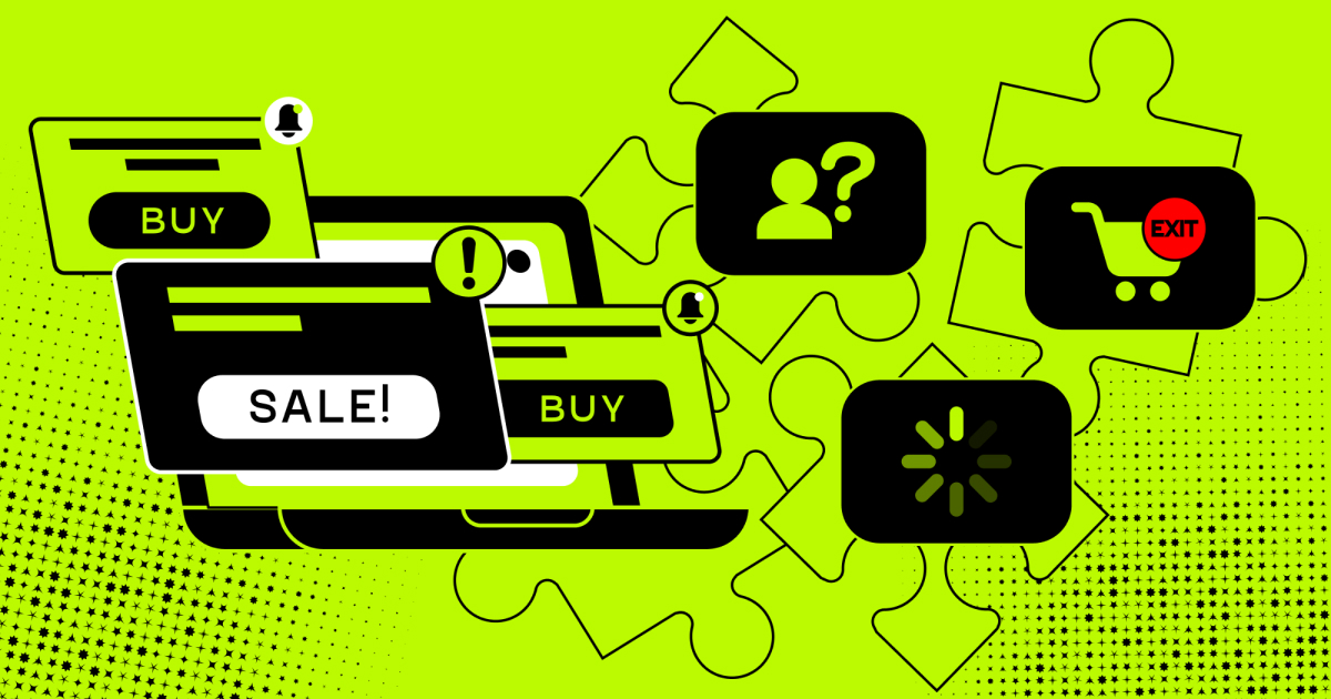
Most websites have low conversions because the way from landing to converting is unclear, slow, or not convincing. This guide shares insider website conversion tips that you need to know about conversion rates. We describe the testing basics, technical fixes, trust signals, and habits that help you improve results over time.
A data-driven basis gives you a clear goal, a mapped funnel, and the right segments.
Knowing your competition and friction points tells you where to focus first.
Value proposition closes the gap between arriving and understanding why to stay.
Personalization, social proof, and AI chatbots keep visitors in the funnel.
Real proof, customer feedback, and case studies remove the doubt.
Clear navigation, visual hierarchy, and responsive design make the path to purchase obvious on every device.
High-quality media and multiple payment options remove the final barriers.
Mobile accessibility and fast load ensure your tech foundation supports messaging.
A/B testing and behavioral data turn every result into the input for the next phase.
Retargeting and continuous iteration keep recovering value from visitors who did not convert the first time.
In every block, you will also find relevant examples, success stories, and a clear breakdown of the steps to improve conversion rates and keep them increasing over time.
The power of experimentation in CRO
Most websites have a conversion problem. Only the top websites have a conversion rate of 11% or more. The rest are way, way lower, and yours is most probably in this situation as well.
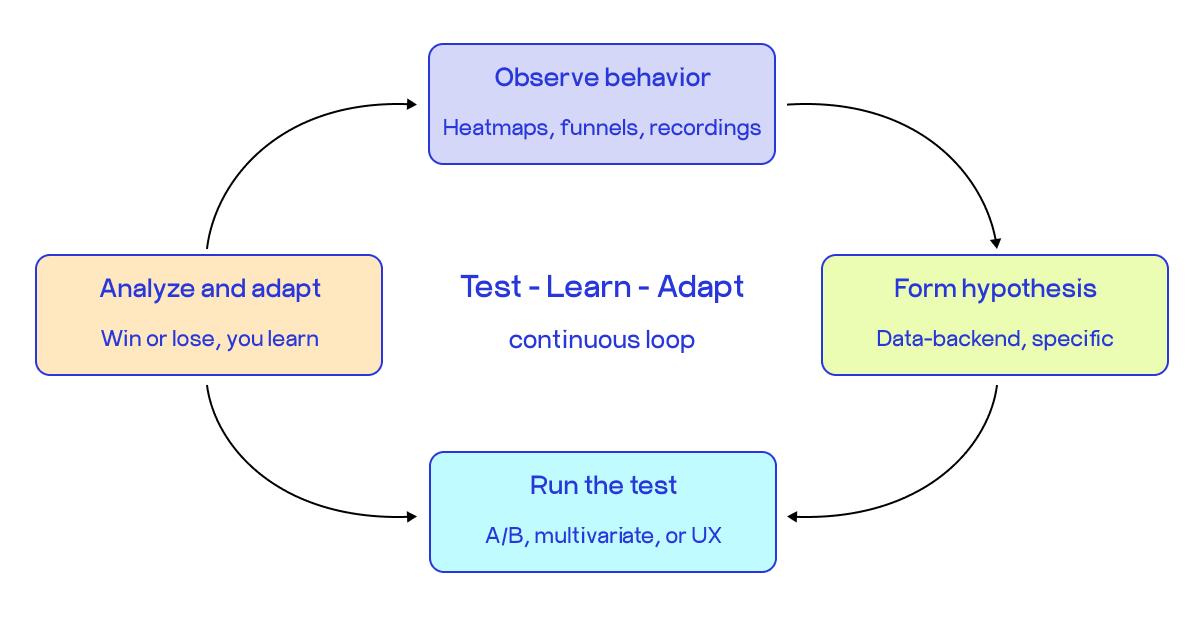
And many teams try to apply cosmetic fixes. But the real answer is not a better button or a new headline. It is a process. One that runs continuously, learns from every result, and gets better over time. Here, we’re coming to the concept of what experimentation means in CRO.
Continuous testing and learning means running structured experiments on your website, reading the data, and using that to design the next experiment. This is an all-time continuous process. You notice that visitors are leaving at a specific step, or a page with high traffic has surprisingly low conversions. You build a hypothesis about why, and then run a test to confirm or disprove it. Then you take what you learned and feed it into the next round. Every cycle sharpens your understanding of how your users behave and what actually moves the numbers.
An important thing to remember if you want to boost conversions: a test that confirms your hypothesis is useful, but a test that contradicts it is equally useful, and sometimes even more so. The worst outcome is a test that ran with no hypothesis and taught you nothing.
For instance, Going ran a focused A/B test on a single CTA, "Sign up for free" versus "Trial for free," and saw a 104% month-over-month increase in premium trial starts. This result came from a clear hypothesis, a clean test, and a team that read the outcome properly.
To improve conversion rates consistently over time, three things need to be in place.
Every test needs a written hypothesis before it runs, tied to actual behavioral data, not assumptions.
The team scoping tests need to include marketing, product, and data together, because the best hypotheses come from combining campaign signals with in-product behavior and funnel analytics.
Results need to feed forward, not just get filed. Both wins and losses move the program forward.
If you want a practical framework for building this kind of program, including checklists and test templates for every stage, the CRO quick wins guide covers it end-to-end, with practical procedures to follow and matter-of-fact tactics to implement. If you need a handbook to get those low-hanging fruit fast, this is your go-to guide.
So far, let’s move forward to understanding how to build a solid basis for your experiments.
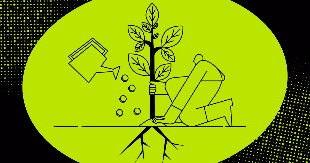
Build a data-driven foundation
You cannot optimize what you have not defined. Before you run a single test, you need to know what your site is supposed to do, where it is failing, and who exactly is failing to convert. Here is how to build that foundation.
Your website needs a goal
Every page on your site should push visitors toward one action. Not five. One. That action is your conversion goal, and every design decision, copy choice, and test you run should connect back to it.
The most useful website conversion tips start here: pick a primary conversion goal per page, then work backward. What does a visitor need to see, feel, and understand before they take that action? Write that down specifically before you do anything else.
For example, if your homepage tries to get visitors to sign up, browse products, read a blog, and contact sales at the same time, it is doing none of those things well. Don’t do like Netflix with their autoplay feature: many users complain about it being confusing and frustrating, as their goal is to discover movies, not play them while discovering. The goal should be only one.
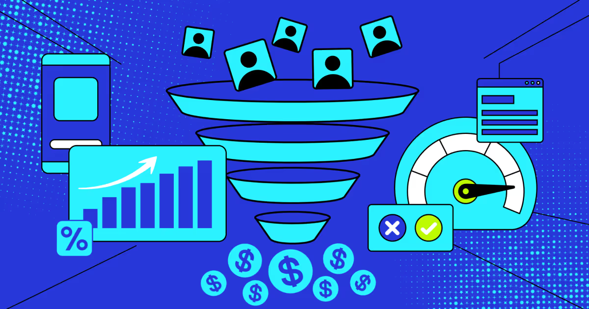
Set up a sales funnel
Your funnel is the sequence of steps a visitor takes from first landing on your site to completing your conversion goal. Improving conversion rates starts with knowing where people drop off in that sequence.
Set up your funnel in your analytics tool and look at the drop-off rate at each step. The biggest drop-off is your priority. Not the last step, not the step that feels most familiar. The one where most people leave. For instance, a basic e-commerce funnel looks like this:
Landing page.
Product page.
Add to cart.
Checkout.
Purchase confirmation.
Each transition is a point where you can lose someone. Each one is also a point where a targeted fix can recover real revenue.
Compare yourself with the competition
You need a reference point. Knowing your conversion rate is 2.3% means nothing on its own. Knowing your competitor converts at 4.8% and the industry median is 3.1% tells you exactly how much ground you are losing and where the ceiling realistically sits.
Conversion rate improvement should include an honest competitive audit. Look at what your top three competitors do differently on their product pages, checkout flows, and CTAs. You are not looking to copy them. You are looking for patterns that show what your shared audience responds to, and gaps where you can do better.
Tools like Semrush, SimilarWeb, and BuiltWith can show you traffic sources, site structure, and the tools competitors use. Pair that with a manual walkthrough of their conversion flows as a first-time visitor.
Identify friction points
Friction is anything that slows a visitor down or gives them a reason to leave. A form with too many fields. A page that loads in 6 seconds. A CTA buried below the fold. A checkout that asks for account creation before purchase.
The goal here is to increase conversion rate by removing obstacles, not adding features. Heatmaps show you where users click and where they stop. Session recordings show you where they hesitate. Exit surveys tell you why they left.
Some of the most common friction points you will find:
Navigation that hides the main action.
Mobile layouts that break at key steps.
Trust signals are missing near the point of decision.
Forms asking for information you do not actually need.
Fix the structural ones first. A/B testing a headline on a page with a broken mobile checkout is wasted effort.
Segment site visitors
Aggregate data lies. Your overall conversion rate is an average of very different user groups behaving very differently, and treating them as one audience produces changes that help nobody. Website conversion best practices require segmentation before any test. At a minimum, split your data by:
New vs. returning visitors.
Traffic source (organic, paid, email, direct).
Device type (desktop vs. mobile).
Geographic location.
First session vs. multi-session users.
A new visitor from a paid ad needs immediate orientation and trust signals. A returning visitor already knows your brand and needs a faster path to purchase. Showing both the same experience optimized for neither is one of the most common reasons programs plateau.
COAX starts every engagement with a segmented behavioral audit before a single test is scoped. In one case, an antique marketplace with 120,000 monthly visitors had page load times of 6 to 8 seconds and a Core Vitals score below 20. After COAX mapped the full funnel by segment and identified the structural drop-off points, load time dropped to 0.5 seconds, Core Vitals hit 90+, and conversions rose 28%. None of that came from guessing at which button to test. It came from knowing exactly where and why users were leaving.
Our end-to-end CRO audit services cover up to 10 key conversion points, study 3 to 5 competitors, and deliver a short report with flagged blockers and mapped revenue leaks in 2 to 5 business days at no cost. For teams that need deeper work, the CRO potential audit adds funnel mapping, behavioral analysis, and a full A/B test roadmap. That diagnostic foundation is what makes a website conversion strategy testable and specific rather than a list of guesses.
Communicate why you matter
You can fix every technical issue on your site and still lose visitors in the first paragraph. If people cannot immediately understand what you do, why it is different, and why it matters to them, they leave. This section is about closing that gap.
Create a compelling UVP
If your team has ever sat down and asked "how to increase landing page conversion rate?", the first best answer is usually: your value proposition is unclear. A unique value proposition is a single sentence that tells a visitor what you offer, who it is for, and why it beats the alternative. It lives above the fold. It does not use jargon. It answers the question a new visitor has before they even know to ask it: "Why should I care about this?"
A strong product marketing strategy builds everything around that sentence. Your headlines, CTAs, and feature descriptions should all extend from it, not contradict it. If your homepage headline says "innovation for tomorrow" and your CTA says "request a demo," there is no thread connecting them. Visitors feel it even if they cannot name it.
Test your UVP with someone who has never heard of your product. Give them 5 seconds on your homepage, then ask them what you do. Their answer tells you whether it is working.
Get going with personalization
One message for all visitors is a losing strategy. A first-time visitor from a paid ad, a returning user who abandoned checkout, and a repeat buyer browsing new arrivals are three completely different people with three different needs. Showing them the same page is the single fastest way to leave increasing conversions on the table.
Personalization does not have to mean complex technology. Start with the basics:
Show different headlines to paid vs. organic traffic.
Surface recently viewed products for returning visitors.
Adjust CTAs based on where someone is in the funnel.
Use location to surface relevant offers or inventory.
Even small personalization signals, like acknowledging that someone has been here before, reduce the cognitive load of deciding whether to stay.
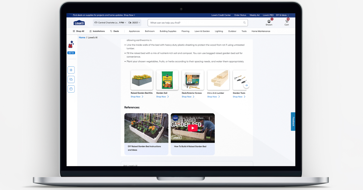
Use AI chatbot technology
Most visitors who leave your site without converting had a question that went unanswered. A well-placed AI chatbot does not just handle support. It improves conversion rates by catching hesitation in real time, surfacing the right information, and keeping people in the funnel who would otherwise leave to find the answer somewhere else.
The keyword is "well-placed." A chatbot that fires on every page 3 seconds after load is friction, not help. A chatbot that appears on your pricing page when someone has been scrolling for 45 seconds is useful. Trigger logic matters as much as the conversation itself.
Create a marketing strategy
A UVP, personalization, social proof, and a chatbot are all tactics. Without a specific mix of marketing and conversion strategy that connects them to a specific audience, funnel stage, and business goal, you are running disconnected experiments that do not compound.
A real marketing strategy defines who you are targeting, what they need to believe before they convert, and which channels and messages move them toward that belief at each stage of the funnel.
COAX helps you build that foundation through hands-on work, starting with expert-led B2B conversion rate optimization tailored to your specific industry, use case, and target audience. We cover audience segmentation, messaging architecture, and funnel mapping that connects your UVP to every touchpoint.
We also help teams think about generative engine optimization, making sure your brand shows up accurately and favorably when AI tools like ChatGPT or Perplexity answer questions your buyers are asking. As more discovery happens inside AI interfaces rather than search results, being present there is part of any serious marketing strategy. Our experts create chatbots trained on your datasets to make their communications with your users as relevant and secure as possible.
Reduce risk and build confidence
Visitors do not convert because they are unsure. Unsure the product will work, unsure the company is real, unsure they will not regret the decision. Your job is to remove that uncertainty before they leave. Here is how.
Offer proof: data, results, real outcomes
Claims without evidence are just marketing copy. Numbers change that. Specific, verifiable outcomes give visitors a concrete reason to believe you before they buy.
Where to put proof:
Hero section: one specific outcome, not a tagline.
Near your primary CTA: a stat or result that handles the last moment of hesitation.
Product or service pages: numbers tied to the specific feature or outcome that the page is about.
The most effective website conversion strategies lead with proof rather than promises. Instead of "we help businesses grow faster," say "our clients reduced checkout abandonment by 22% in the first month." One is a claim. The other is a result. Visitors read them very differently.
Add customer feedback
Reviews, ratings, and testimonials are among the cheapest and most reliable website conversion tips available. They work because they shift the burden of persuasion from you to someone your visitor trusts more: another customer.
But how to increase website conversion rate with the right feedback placement? Placement and specificity determine whether they actually help or just decorate the page. A wall of five-star ratings at the bottom of your homepage does almost nothing. A single testimonial placed next to your pricing table that says "I was hesitant about the cost, but we recovered it within six weeks" does a lot.
Match the testimonial to the objection it handles, and place it at the moment in the page where that objection typically surfaces. That is the difference between social proof as decoration and social proof as a conversion tool.
Case studies
Case studies do the job that testimonials cannot. They show the full before-and-after, which is what a skeptical buyer actually needs to see when the decision involves real money or real risk.
The best case studies for increasing conversion rates are structured around a problem the reader recognizes, a specific solution, and a measurable outcome. Not a narrative about how great the partnership was. TruckersReport had a logistics landing page converting well below its potential. Instead of guessing at fixes, they ran A/B tests, then simplified the layout, sharpened the headline, and made the CTA more direct. The page saw a 79.3% jump in conversions without any increase in traffic. That result occurs because it is tied to specific actions, and because the problem is a page that was not working hard enough for the audience.
The headline of your case study should lead with the outcome, not the client's name. "How we helped a logistics company" tells a reader nothing. "79% more conversions from the same traffic" makes them stop scrolling.
All of this, proof, testimonials, case studies, and risk reduction, depends on one thing: having the right content in the right place at the right time. COAX covers that fully through content marketing services that go beyond writing blog posts. We build the full content architecture that supports your conversion funnel: outcome-led case studies, testimonial frameworks, landing page copy structured around real objections, and messaging that connects your proof points to the moments in the buyer journey where doubt is highest. If your site has the traffic but not the trust, that is usually a content and positioning problem, and it is what our team can solve.
Make it easy to buy from you
Visitors who want to buy but cannot figure out how to do it quickly will leave. The barrier is rarely price or product. It is friction. SwimOutlet redesigned their pricing page, moved a few elements, added product descriptions and videos, and removed a button that was creating confusion. Conversions went up 25%. No new traffic, no new product. Just a clearer path to purchase.
Simplify the navigation
Navigation is the skeleton of your site. If visitors cannot find what they are looking for in two clicks, most of them will not try a third time. To increase conversion rate through navigation, the rule is simple: fewer options, clearer labels, and the most important action always visible.
Remove links that do not serve the conversion goal of that page. If your homepage goal is to get a demo booking, your navigation does not need to send people to your blog, your about page, and your careers page all at equal visual weight. Hierarchy in navigation mirrors hierarchy in intent.
The Olympic Store improved its website navigation and saw a 7.74% increase in conversions. No redesign. No new copy. Just a cleaner path to what visitors were already looking for.
Responsive design
A page that works beautifully on desktop and breaks on a phone is not a functioning page. It is a conversion leak you are paying to maintain. Responsive design means your layout, images, forms, and CTAs adapt to the screen they are viewed on without losing hierarchy or usability.
A button that is easy to click on a desktop needs to be easy to tap on a mobile. A form that takes 30 seconds to complete on a laptop should not take 3 minutes on a phone. Improve conversion rate on mobile by treating it as a primary experience, not an afterthought.
COAX builds responsive design as a standard part of every project, not an add-on. Whether you are building from scratch or fixing an existing site, our team ensures that every conversion-critical element, forms, CTAs, checkout steps, and product pages, works across every device and screen size.
Use visual hierarchy and contrasting colors
Your page has one job: guide the visitor's eye toward the action you want them to take. Visual hierarchy is how you do that.
H1 sets the topic.
H2 breaks down the argument.
Body copy provides detail.
The CTA stands apart from everything else through size, color, and position.
The question of how to increase your conversion rate through design almost always comes back to contrast. If your CTA button is the same color as your background, it disappears. If your headline is the same visual weight as your subheadings, nothing stands out. Humana added red to a previously plain CTA and saw a 2.5% lift. Simple visual contrast, measurable result.
COAX's web development services include front-end design built around a conversion-first visual hierarchy. We do not just make pages look good. We structure them so the eye lands where the action is.
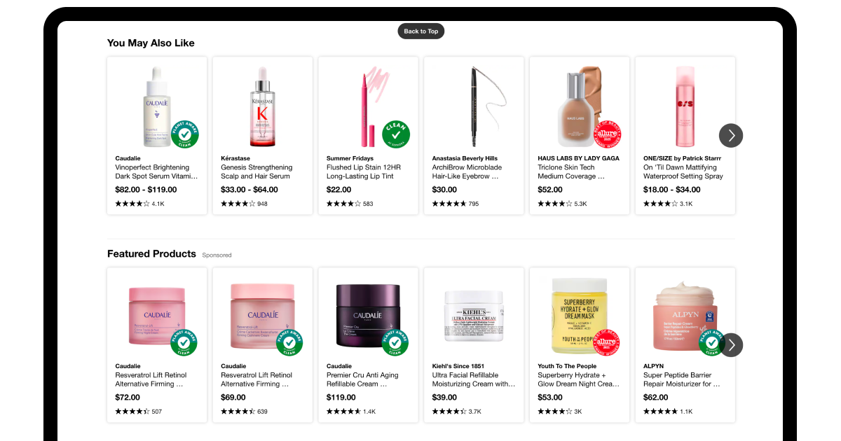
Add high-quality images and videos
Visitors cannot touch your product. Images and video are the closest substitutes. A blurry photo or a stock image that looks nothing like your actual product creates doubt. A sharp, contextual image that shows the product in use builds confidence.
Increasing conversion rate through media is well-documented. Adding video to a homepage has driven 100% increases in email opt-ins in controlled tests. Larger product images produce sales lifts for e-commerce retailers. The mechanism is the same in both cases: better media reduces the gap between "I wonder what this is like" and "I understand this well enough to buy it."
Keep videos short, under two minutes for most use cases. Show outcomes, not just features. And optimize file sizes so media does not slow the page down and undo the gains it created.
Offer multiple payment options
At the final step of the funnel, the only thing standing between a visitor and a conversion is payment. If your preferred method is not available, you lose the sale, not because of anything wrong with your product, but because of friction at the finish line.
This is one of the most overlooked website conversion tips for e-commerce. Offering credit cards, PayPal, Apple Pay, Google Pay, and buy-now-pay-later options does not just add convenience. It removes a concrete blocker for specific user segments who will not convert without their preferred method.
COAX's custom eCommerce development covers payment integration completely, from connecting multiple payment gateways to optimizing product pages for the moments that matter most before checkout. If your product presentation is weak or your payment flow creates hesitation, those are fixable problems with measurable outcomes.
Enhance technical performance
You can have the right message, the right offer, and the right audience, and still lose conversions to a slow page, a broken mobile layout, or a checkout that asks for too much. Technical performance is not a background concern. It is a direct conversion lever.
Be accessible on mobile
Mobile traffic crossed 60% of all web visits and keeps climbing. If your site was designed primarily for desktop, you are optimizing for the minority of your audience while the majority bounces. Conversion improvement on mobile starts with treating it as the primary experience, not a scaled-down version of desktop.
What accessible mobile design actually means in practice: touch targets large enough to tap without zooming, forms that do not require horizontal scrolling, CTAs visible without scrolling past a wall of content, and text readable without pinching. Mariemur added reassurance copy about their return policy during mobile checkout and saw a 29% conversion rate uplift. One small addition, placed at the right moment in the mobile flow, was enough to change the outcome.
COAX builds custom mobile applications and mobile-first web experiences that treat conversion as a design requirement from the first screen. Our mobile UX and UI design process is built around engagement, return rates, and ease of navigation across every device type.
Identify friction points
Friction is anything that makes a visitor slow down, hesitate, or give up. It is not always obvious. Most friction is invisible until you measure it. To improve conversion rates, you need to find it systematically.
The most reliable sources of friction to investigate:
Forms with too many fields or confusing labels.
Pages with slow load times, especially on mobile.
CTAs placed below the fold or are visually buried.
Check out the steps that require account creation before purchase.
Unclear pricing or hidden fees appearing late in the flow.
Search and filter tools that return poor results or break on mobile.
Trust signals are missing at the point of decision.
Increasing conversions through friction removal is often faster than any copy or design change because you are not adding anything new. You are clearing the path that was already there. For instance, GrantMe simplified their "Book a Call" page, repositioned the CTA, and improved the calendar interface. That single page saw a 56% conversion rate uplift.
Reduce load time
Every second of load time costs you visitors. Pages loading under one second convert at three times the rate of pages taking five seconds. This is not a small margin. It is the difference between a functioning funnel and a leaking one.
One of the most concrete conversion rate optimization tips available is this: measure your current mobile load time, then treat anything above 2.5 seconds as a conversion problem. Common fixes include compressing and lazy-loading images, deferring JavaScript execution, reducing third-party scripts, and using modern image formats.
From our practice, we rebuilt the infrastructure behind RoadStr, a social platform with over 150,000 downloads that had slow load times and performance bottlenecks, which were dampening engagement. After modernizing the architecture and implementing advanced caching, page load speed improved by 71%. As a result, session drop-offs decreased, users explored more content per visit, and key conversion actions, from event participation to marketplace interactions, significantly increased.
Optimize your checkout
At checkout, the purchase intent is highest, but right there, most e-commerce sites lose the most revenue. The average cart abandonment rate is above 70%. A significant portion of those exits are not decisions against buying. They are reactions to friction: too many steps, unexpected fees, forced account creation, or a payment method that is not available.
Understanding how to improve conversion rate at checkout is often a short list of fixes:
Reduce the number of steps.
Show delivery costs early, not at the final screen.
Allow guest checkout.
Add progress indicators so users know how close they are to being done.
Place trust signals, return policies, and security badges near the payment fields, where anxiety peaks.
COAX approaches all of this through the lens of designing customer experience end-to-end. For us, it means the checkout is not treated as a standalone technical component but as the final moment in a journey that either earns or loses a sale. Our team maps that journey, identifies where confidence breaks down, and builds the technical and UX solutions that close the gap between intent and completion.
Keep improving results over time
Most CRO work does not fail because the ideas were wrong. It fails because teams stop too soon. They run one test, see a modest lift, and move on. However, sustained conversion improvement is a system that compounds over time. If you are serious about growth, your conversion rate optimization guide should treat iteration as the strategy, not the bonus step.
Do A/B testing
A/B testing is how you get precise data. You take two versions of a page, a headline, a CTA, and a form layout, and you split traffic between them. One wins. You keep it, build on it, and test the next thing. Over time, those incremental wins stack into a much better-converting site.
The catch is that most teams test the wrong things, in the wrong order, without enough traffic to reach statistical significance. They test button colors when the real problem is the headline. They stop a test after three days. They run five tests simultaneously and cannot isolate what moved the needle. How to improve conversion rate on website is a question that A/B testing can answer precisely, but only when the testing architecture is sound.
COAX's testing strategy development practice is built around exactly this kind of structured, sequenced experimentation. We help you identify which elements to test first based on traffic volume and conversion impact, design clean test structures that produce reliable results, and sequence experiments so that each one informs the next rather than running in isolation.
Analyze your website data
Analytics tell you where visitors are dropping off, which pages are holding attention, which traffic sources convert, and which ones burn your budget. The goal is not to collect data. It is to build a habit of reading it as a diagnostic, not a report card.
To increase your conversion rate, you need to look beyond aggregate metrics. Overall conversion rate is almost meaningless on its own. Break it down by device, by source, by entry page, by user segment. A site that converts mobile users at 1.2% and desktop users at 4.7% does not have a conversion problem. It has a mobile problem. You will not find that insight in a dashboard summary. You find it when you are willing to drill down and ask why.
Session recordings, heatmaps, and funnel analysis sit alongside quantitative data as essential inputs. They show you the behavior behind the numbers. When you combine both, you stop reacting to symptoms and start diagnosing causes. That is when you can actually durably improve conversion rates, not just patch individual pages.
Retarget non-converting visitors
Most visitors who leave without converting are stuck in a decision window. They compared you with competitors, got distracted, ran out of time, or hit a friction point they did not feel like pushing through. Retargeting puts you back in front of them.
The mistake most teams make is retargeting everyone with the same ad they already saw. If someone visited your pricing page and left, showing them your homepage banner again is noise. Show them a testimonial or a case study. Address the hesitation that the page visit gives.
A relevant example from our own work: COAX built a marketplace for reselling non-refundable hotel reservations. The platform had to convert two distinct audiences, sellers wanting to recover costs and buyers looking for deals, on the same page, at the same moment. Retargeting visitors who left without completing either action required understanding exactly where in the flow they dropped and why. Conversion rate optimization tips built around exit intent and page-depth segmentation consistently outperform generic retargeting because they treat drop-off as a signal.
COAX helps you build and manage retargeting strategies rooted in funnel behavior. We map where visitors exit, what those exit points reveal about objections or missing information, and which messages are most likely to bring them back at the right moment.
Continuously iterate based on results
Every test you run teaches you something. Every data review surfaces a new hypothesis. Every retargeting campaign tells you something about what your hesitant visitors actually need to hear. The teams that win at CRO are the ones who build a feedback loop where each cycle of results directly informs the next cycle of changes.
You can’t get a simple answer to the question of how to increase conversion rate over the long term. It is answered differently every quarter, based on what your data is showing, what your tests have proven, and where your funnel is still leaking. A landing page that converted well last year may underperform today because your audience has shifted or your competitors have raised the bar. The work is never finished, but it gets more precise.
COAX's support and maintenance offering is designed for exactly this kind of ongoing CRO partnership. We stay embedded in the cycle: monitoring performance, flagging regressions, prioritizing the next round of tests, and tracking the cumulative lift across all optimizations. For clients who want to treat conversion as a continuous function of their growth rather than a one-time fix, our support retainers cover monthly analytics reviews, test design, technical QA, and copy iteration. We establish the foundation and keep improving it, one day at a time.
FAQ
How to improve website conversion with limited resources?
Start with what costs nothing: fix your messaging, sharpen your CTA, and remove unnecessary form fields. Then run a free CRO audit with COAX to identify your biggest leaks fast. Our free e-books also cover quick-win frameworks you can action without a developer. Prioritize one friction point at a time. Small, sequenced fixes compound faster than expensive overhauls.
How to improve conversion on a marketplace model?
Trust, simplicity, and clarity are your primary conversion tools.
Verify sellers visibly, enforce transaction-only reviews, and offer buyer protection guarantees. Simplify checkout with guest options and transparent pricing.
Standardize listings with high-resolution images and rich specs.
Use AI recommendations and abandoned cart emails to recover hesitant buyers.
Post-purchase upsells on the confirmation page extend lifetime value without additional acquisition cost.
How to increase conversion rate in travel or logistics?
Complex booking flows, multi-currency pricing, and real-time availability create friction that generic CRO advice misses. COAX has 16 years of building travel and logistics platforms and knows exactly where these funnels break. Start with a CRO audit tailored to your stack. Our e-books will also cover travel-specific optimization patterns for you. We fix conversion at the infrastructure level, not just the surface.
What are the key challenges on your way when you are trying to improve your conversion rate?
The biggest blockers are slow load times, poor mobile UX, and surprise costs at checkout. Add unclear value propositions, weak social proof, and ad-to-page mismatches. Strategically, most teams test on instinct, not data, and treat CRO as a one-time project. In 2026, tracking gaps from privacy updates and increasingly cautious, research-heavy consumers make the baseline harder to measure and move.
How can COAX help improve conversion rates?
COAX brings 16 years of product experience, a 90% mid-to-senior team, and a full-cycle delivery model covering strategy, design, development, QA, and DevOps. We are ISO 9001 and ISO 27001 certified, sign NDAs on every project, and maintain a 4.9/5 Clutch rating. We do not hand off and disappear. We build, optimize, and stay.


.avif)

.avif)
.avif)


.avif)

We are interested in your opinion